The only shipping OT-savvy app right now,
really, is Adobe InDesign 2.0. The OT feature "flyout" in its character
panel is, in my opinion, poorly designed (but does give access to many,
but not all, OT features.)
There is also an "Apply OpenType" plugin for InDesign, maybe
only 1.5 at this point, that gives finer control over features and access
to some features that aren't available in the Character Panel. I have
not seen or used it, but it does come with the latest version of the Adobe
OpenType FDK, which is free.
Currently, the only OpenType-aware application
that provides any kind of support for OT features is Adobe InDesign.
It provides two UI approaches that pertain to OT features.
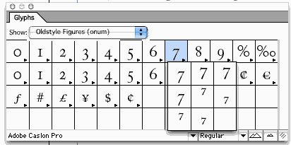
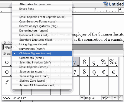
The Insert / Glyph dialog shows the entire glyph palatte from a font, organised by character: you click on a character, and it shows you all the alternate glyphs for that character available in that font (see Fig above). In version 2, it allows you to filter the palatte by OT feature. Thus, the screenshot in Fig on the left shows the pop-up list of features with the "onum" (Oldstyle Figures) tag selected. The screenshot in Fig above showed the palatte with this filter applied; i.e., it shows only those characters for which there are OT lookups under this feature.
The Insert / Glyph dialog shows the entire glyph palatte from a font, organised by character: you click on a character, and it shows you all the alternate glyphs for that character available in that font (see Fig above). In version 2, it allows you to filter the palatte by OT feature. Thus, the screenshot in Fig on the left shows the pop-up list of features with the "onum" (Oldstyle Figures) tag selected. The screenshot in Fig above showed the palatte with this filter applied; i.e., it shows only those characters for which there are OT lookups under this feature.
That UI isn't one that I'd suggest for most
apps. The second UI is closer to what would be appropriate for general use.
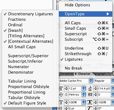
The basic idea is that features are an additional aspect of character formatting,
in addition to point size, italic, etc. Beginning in version 2, on the
formatting palatte, when the Character tab is selected, the palatte menu
will include "OpenType" as one of the menu items. Clicking this will bring
up a sub-menu for selecting OpenType features -- each item in the sub-menu
represents one OpenType feature. See the screenshot in Fig on the right.
I'm pretty sure InDesign uses a hard-wired set of features. Thus, in the
screenshot, you can see some items in square brackets, such as "[Swash]",
meaning that this particular font does not support that feature (hence
selecting that feature will have no effecct). And, if a font supports
a feature not in that list, there simply is no UI for utilising it.
From: John Butler <john.butler@mindspring.com>
Microsoft has been making noises toward the idea of the next version of MS Office fully supporting OT features in Latin fonts. It already does this for complex scripts like Arabic and Devanagari, but I suspect it simply implements the default features and does not give the user control over turning them on or off. I could be wrong about this, cos I focus almost exclusively on Latin script fonts.
I strongly suggest that developers on this list subscribe to the OpenType list as well. Info can be found at http://topica.com/lists/opentype/ .
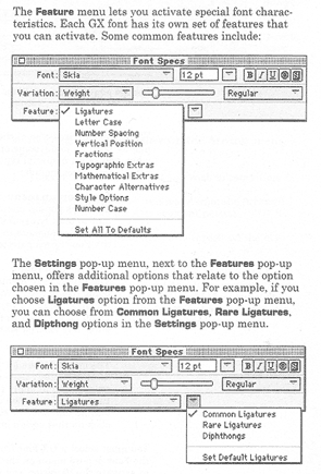
I'm not sure about current apps, but I know that there were some apps in the TrueType GX days that supported features. I believe they provided a UI akin to what we see in InDesign. One significant difference, though: Apple provided (and continue to provide) APIs that made it possible to query the font to determine what features it supported. That way, the UI would present only those features that were appropriate for that font, so you never had a problem of having user-controllable parameters that would do nothing, and you never had to worry about a font having a feature you hadn't anticipated at design time. Fig below shows a page from the manual for one such GX app, Multi-Ad Creator 2. It used a pair of drop-down lists: one for features categories, and another for feature values (needed for non-binary features).
From: John Butler <john.butler@mindspring.com>
The three main apps back during the GX days were LightniongDraw GX by Lari Software, UniQorn by SoftPress, Ready Set Go! by I don't know who, and supposedly a version of Pixar Typestry. These apps really only work on Mac OS up to 8.6. There may be a GX freak or two left on the OpenType list who might be able to supply you with screenshots.
Uniqorn's character formatting dialog has
buttons for setting values of several important features; i.e. a hard-wired
set of features / feature values. There is also a button for popping up a
dialog for other features, but it wasn't shown in the documentation. 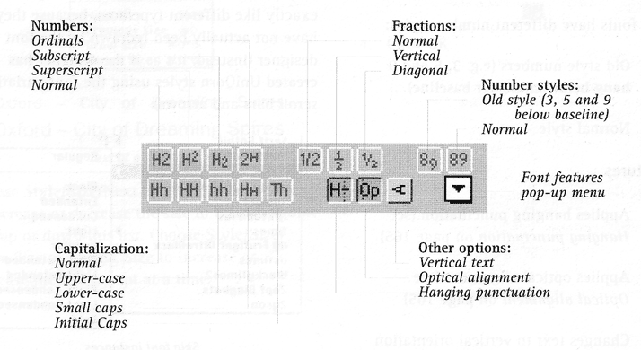
From: John Butler <john.butler@mindspring.com>
The only shipping AAT-savvy app that I know
of is WorldText, which is an MLTE demo buried in the Mac OS X Developer
Tools. You have to install the whole half-a-gig tool suite to get to it.
The Developer Tools come with every Mac OS X package but can also be downloaded
from Apple Developer Connection, which requires free registration.
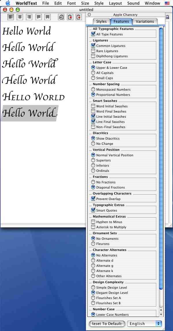
Fig on the right is an example of
a font feature interface presented in a floating palette in the WorldText.
The font here is Apple Chancery; not many fonts have as many different user-selectable features as this, so the list is usually shorter. (Note that the "Hello World" text in the app is in the same font in every case; only feature settings differ.)
The font here is Apple Chancery; not many fonts have as many different user-selectable features as this, so the list is usually shorter. (Note that the "Hello World" text in the app is in the same font in every case; only feature settings differ.)
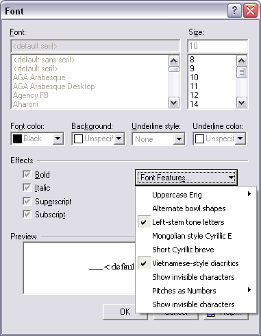
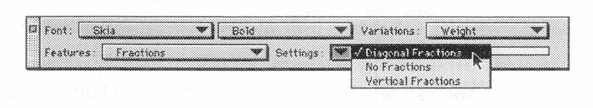
So, what has been done in terms of font features in Graphite isn't anything particularly new -- the basic idea has been around for 10 years or so. The UI in WorldPad (see Fig on the right) has similarities with the UIs in InDesign and Multi-Ad Creator. The font formatting dialog has a drop-down menu with toggle-able items for setting binary features and sub-menus for multi-value features (multiple items can be turned on in the first level menu, but only one item can be set in the second-level sub-menus). It's like Multi-Ad Creator in showing a list that matches what's in the specific font rather than showing a hard-wired list as in InDesign, but it relies on menu toggles and sub-menus similar to what is done in InDesign rather than using two lists as in Multi-Ad Creator. (Note, though, that InDesign doesn't use sub-menus for showing the feature values of non-binary features since OpenType does does only binary features -- a shortcoming, IMO).
A UI could be implemented using more traditional controls -- checkboxes and option buttons -- but those would be less space-efficient.